
projects Overview
Context
Altar’d State is a women’s fashion brand with a mission to give back, offering warm, curated in-store experiences across 100+ boutiques in 30 states. Their digital presence, however, lacked this signature atmosphere. In addition to enhancing their core e-commerce experience, they aim to elevate A Beautiful Soul—their plus-size sister brand—within the same platform.
Challenge
Create a digital experience that captures the spirit and values of Altar’d State’s in-store environment while seamlessly integrating A Beautiful Soul—serving both audiences through one inclusive, mission-driven platform.
Solution
A unified digital ecosystem that brings Altar’d State’s mission and boutique warmth online. A shared design system supports both brands while honoring their distinct identities, enhancing exploration, engagement, and conversion through personalized, content-rich experiences and a streamlined checkout.
Contribution
I owned the end-to-end design process for core site experiences—homepage, navigation, product pages, checkout, and blog—balancing strategic UX thinking with detailed UI execution. Collaborating closely with design, content, UX, PM, engineering, QA, and optimization teams, I delivered user-centered solutions on a fast-paced timeline.
Impact
18%
Traffic lift
51%
Revenue growth
•
Enhanced user engagement through improved navigation, product discovery, and personalization
Discovery & Insight
•
•
Source: Client workshop, customer interviews, Netbase Altar’d State Social Analysis


•
•
•
•
•
•
•
Source: Isobar MindSight™, Dentsu Aegis Media Insights, Netbase Social Analysis


•
•
•
Source: Google Analytics, Google Search Console
Design Goals
Business Goals
User Goals
Experience Foundations
Before diving into design, we partnered with stakeholders to explore two site structure models that would define how Altar’d State and A Beautiful Soul coexist in one experience.
Option 1:
Distinct
Each brand builds its own independent experience, with separate spaces for content and products


Option 2:
Integrated
Content and products from both brands are woven together—starting from the homepage and extending across shared categories and features


Decision Rationale
We selected the integrated approach to create a more seamless and brand-connected experience. This direction best supported both user needs and business goals:
•
Supports unified storytelling while allowing for distinct brand expression
•
Promotes A Beautiful Soul without siloing it from the overall experience
•
Encourages cross-brand discovery through shared categories and content

We created distinct personalities for our two sister brands through thoughtful color and typeface choices. Altar'd State feels peaceful and indulgent, while A'Beautiful Soul expresses confident elegance. All colors are accessibility-compliant to keep our UI inclusive.


I audited best-in-class e-commerce sites to identify UX best practices across product discovery, interaction, and layout. The findings helped shape our design decisions and ensured alignment with both user expectations and technical feasibility through early engineering collaboration.

Exploration & Solution


Explored Options:
•
Dynamic media sizes created visual flow but caused inconsistent, potentially chaotic layouts due to variable product content
•
Integrated pairing products added visual interest but made user experience unpredictable
Final Decision:
•
Standardized single-width product media reduces visual noise and lets products shine
•
Consistent pairing product placement in sticky card ensures predictable user experience
Key Tradeoff:
•
Chose consistency and usability over dynamic visuals—prioritizing user predictability for better overall experience


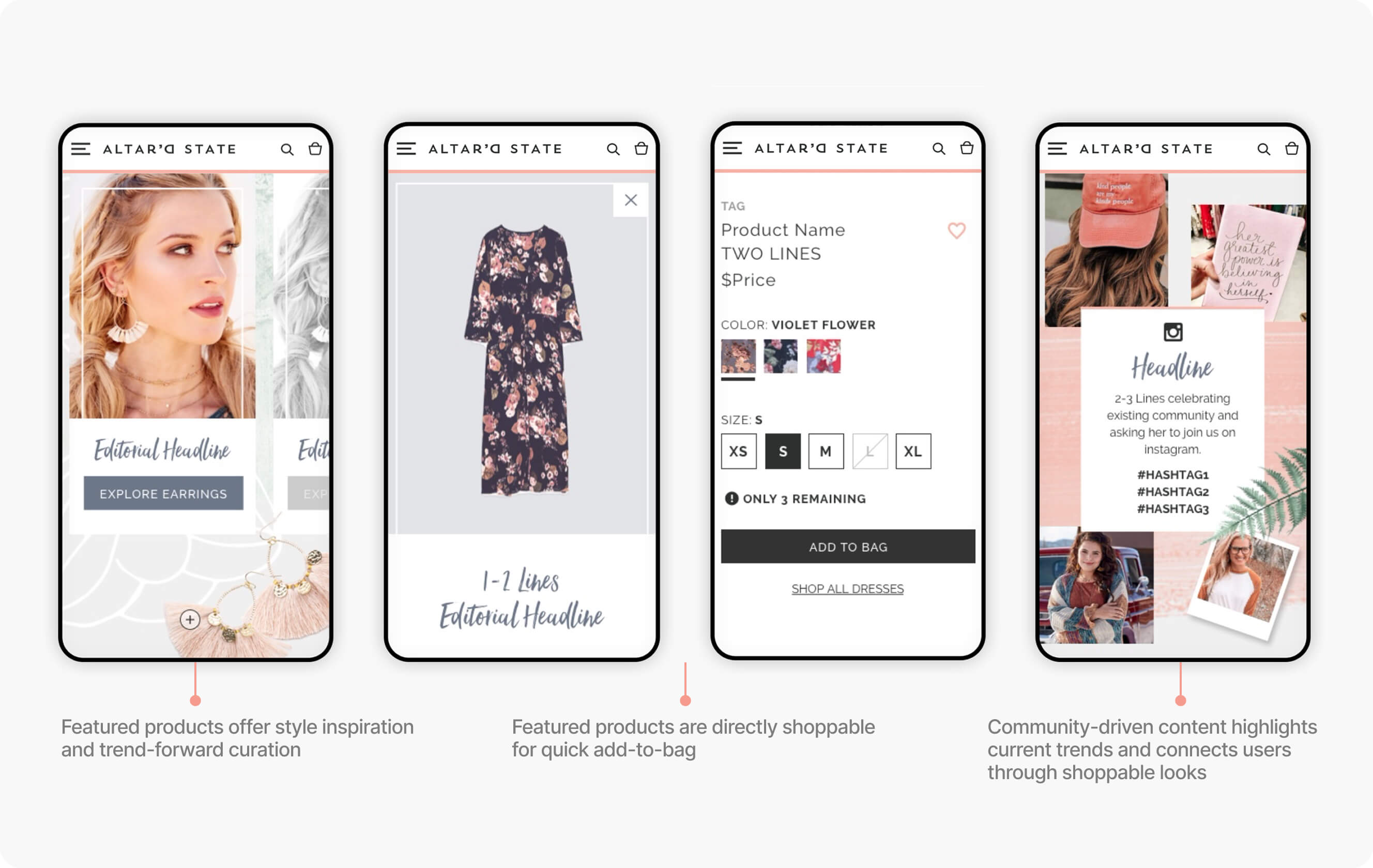
Mobile-optimized experience designed for discovery, personalized inspiration, and seamless checkout


Delivery & Impact
I delivered detailed final designs, a comprehensive style guide, and a robust component library that streamlined the design-to-development handoff process. Through close QA collaboration with engineering, I refined interactions and resolved implementation details. Working with the PM, I helped prioritize features for UAT and soft launch while keeping core user journeys intact.
The final launch resulted in 18% higher traffic and 51% revenue growth, enhancing user engagement through improved navigation, product discovery, and personalization.
18
%
Traffic lift
51
%
Revenue growth

reflection & learning
•
Stepping into a lead role beyond my title expanded my perspective.
Owning the full design process—from UX structure to visual expression—taught me to align vision, execution, and collaboration across disciplines. I also learned to communicate design intent more effectively and manage upward with clarity and confidence.
•
Designing under pressure sharpened my focus.
Working within a tight timeline and a graphic-heavy style helped me stay organized and intentional. Building a component library kept creativity flowing while maintaining efficiency.
•
Balancing creativity with feasibility strengthened my problem-solving.
I learned to translate bold ideas into realistic solutions that enhanced engagement while adapting to technical constraints and development resources.


