

projects Overview
Context
Zwilling, a legendary brand known for its premium knives, has grown into the Zwilling Group—home to some of the world’s most respected culinary brands. But after years of acquisitions, its digital presence became disjointed, weakening the luxury feel and making the portfolio harder to navigate.
Challenge
Zwilling needed a cohesive global platform to unite its family of brands while staying flexible for future acquisitions. The experience also had to honor the brand’s heritage, showcase its high-end positioning, and foster deeper customer connections beyond transactions.
Solution
A scalable global platform that unites Zwilling’s brands under one system while giving each its own expression. By combining heritage with elevated content and seamless commerce, the experience strengthens customer connection, simplifies discovery across the portfolio, and delivers a refined mobile experience.
Contribution
I shaped the scalable design system and designed key flows—including brand and category landing pages, checkout, and main navigation—partnering with creative directors, UX, content, engineering, and QA teams from design to launch.
Impact
Discovery & Insight
These insights established the principles and frameworks that shaped a consistent, user-centered digital experience.

Client workshops highlighted the need to elevate brand heritage and product craftsmanship as central to the Zwilling experience

A review of existing brand and product sites identified three key page types: story-centric, product-focused, utility-driven

My UX teammates mapped scenarios across pre-purchase, purchase, and post-purchase phases, highlighting user needs and opportunities for engagement.

Layouts at different levels of the experience defined content structures and hierarchies, providing a framework for consistent yet flexible page design.
Experience Foundations
We built a modular design system to keep Zwilling’s brands cohesive while scaling for global rollout and future acquisitions. Building on moodboards from my associate creative director, I extended the system into components and page designs that balanced brand expression with consistency.


Exploration & Solution
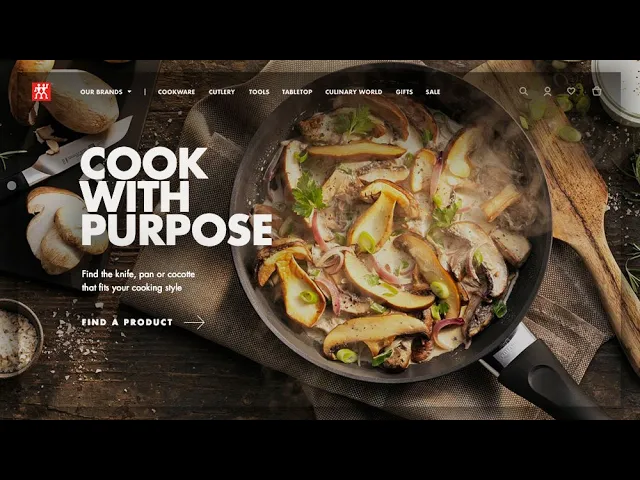
The homepage was designed to guide users into different shopping scenarios while showcasing the breadth of Zwilling’s brand portfolio, leading naturally into brand landing pages.

Site content highlights Zwilling’s legacy through storytelling, product craftsmanship, and cultural context—deepening emotional connection with a globally respected brand.

Crafting brand landing pages with distinct voice, imagery, and typography
I applied each brand’s unique typeface, paired it with carefully chosen lifestyle imagery, and collaborated with the content team on copy to create an authentic, immersive brand experience.

The design system shifts from immersive brand entry points to simplified category layouts, helping users move naturally from inspiration to focused product exploration.

A clean, minimal design in Category Landing page lets products take center stage while making it easy to navigate across product categories.

Each Product Detail page blends clarity with storytelling—showcasing craftsmanship and quality while weaving in expert voices and lifestyle context. This approach builds confidence, trust, and deeper emotional connection with the brand.


Progressive disclosure:
A clean search bar introduces a simple starting point, with more options revealed as users engage
Contextual suggestions:
Popular searches appear immediately, giving quick entry points and signaling what’s available
Guided discovery:
Suggested terms help users refine their path and find relevant results with ease
Visual hierarchy:
Clear typography and generous spacing guide attention smoothly from search bar to suggestions to results

Product Finder
Intent-based design:
Conversational prompts guide users to narrow choices by clarifying their purpose, cooking experience, scenario, and intended product use.
Dual-path navigation:
Supports both browsing and task-focused journeys, accommodating different mindsets.
Reduced decision fatigue:
Limited, well-defined choices simplify entry and make it easy to get started.

Brands dropdown:
Offers a structured overview of each brand and its main product categories

Culinary World:
Engages users with lifestyle content that builds brand connection and long-term loyalty

Brand-level navigation:
Highlights the current brand’s offerings while making it easy to discover others

Scalable design:
Built for flexibility, ensuring consistency across languages and international sites
Mobile navigation:
Streamlined structure reduces friction and makes way-finding intuitive across devices

Delivery & Impact
Partnering closely with cross-functional teams from concept to launch, we delivered a unified platform for six Zwilling brands across 22 languages and 17 countries.
The redesign led to a 51% sales growth, 35% increase in mobile users, 7% more orders, and 5M+ new users within three months—and earned a WebAward for Best Consumer Goods Website.
51
%
Sales growth
35
%
Mobile user growth
22
Languages
7
Countries
WebAwards for Outstanding Achievement in Best Consumer Goods Website

reflection & learning
•
Balancing simplicity with storytelling deepened my craft.
Working alongside the content team, I refined how design and language come together to create experiences that feel clear, human, and purposeful.
•
Building a scalable system strengthened my holistic thinking.
Creating a flexible design system for a global platform—spanning brands, product types, and languages—expanded my perspective on designing for scale and consistency.
•
Designing across journeys cultivated my empathy.
Working through the full user flow—from brand discovery to purchase and beyond—helped me understand diverse motivations and design with continuity in mind.


